3 Ways to Inspire People to Use a Carbon Calculator
Ready to boost your SEO ?
3 Ways to Inspire People to Use a Carbon Calculator
We recently launched an online carbon calculator for a non-profit we started called ConcordConserves.org (CCO). Since being introduced in January this year, 384,357kg of c02 has been eliminated and over 330 people have participated, far exceeding our expectations.
We first researched all the live calculators out there looking for the best features and platform for developing it. The calculator we came up with has 3 parts:
- Calculate: The ability to calculate your footprint based on transportation, food and home energy use
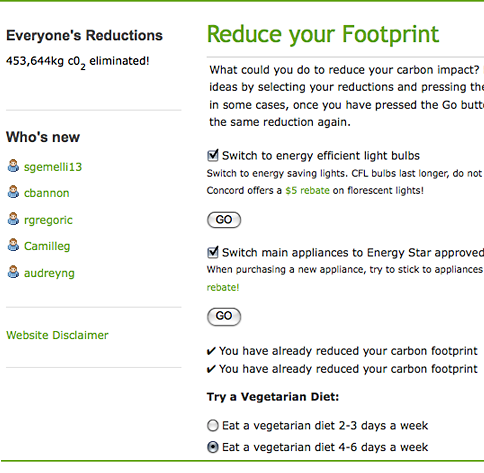
- Reduce: The ability to reduce your footprint by selecting actions from a list weighted towards local rebates
- Compete: The ability to compete with others to see who can reduce the most
After investigating several web development platforms we decided to use Drupal, the open source content management system since it gave us the functionality and flexibility we needed.
But what made the calculator appealing and how did we get so many reductions? Here are the 3 best aspects we think did the trick.
1. Compete: this feature has been far and away the most effective part. It’s implemented using groups. In this instance a teacher at the local high school decided to use it for the Earth Science department, where there are about 11 classes. Each class is a group and each competes with each other to see who can reduce the most.
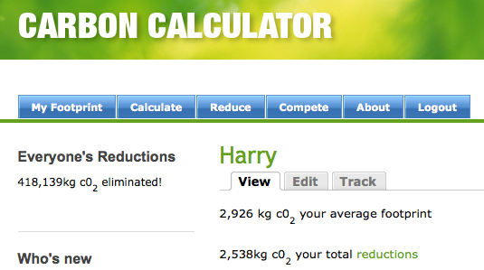
2. Peer View: The calculator allows people to see what reductions groups have done as well as contact each other and post comments. Since peer relationships have shown to be one of the most powerful drivers when trying to influence and change people’s behavior, we wanted to emphasize this part. Adding community/social media features is a big plus when trying to get people to use an online calculator.
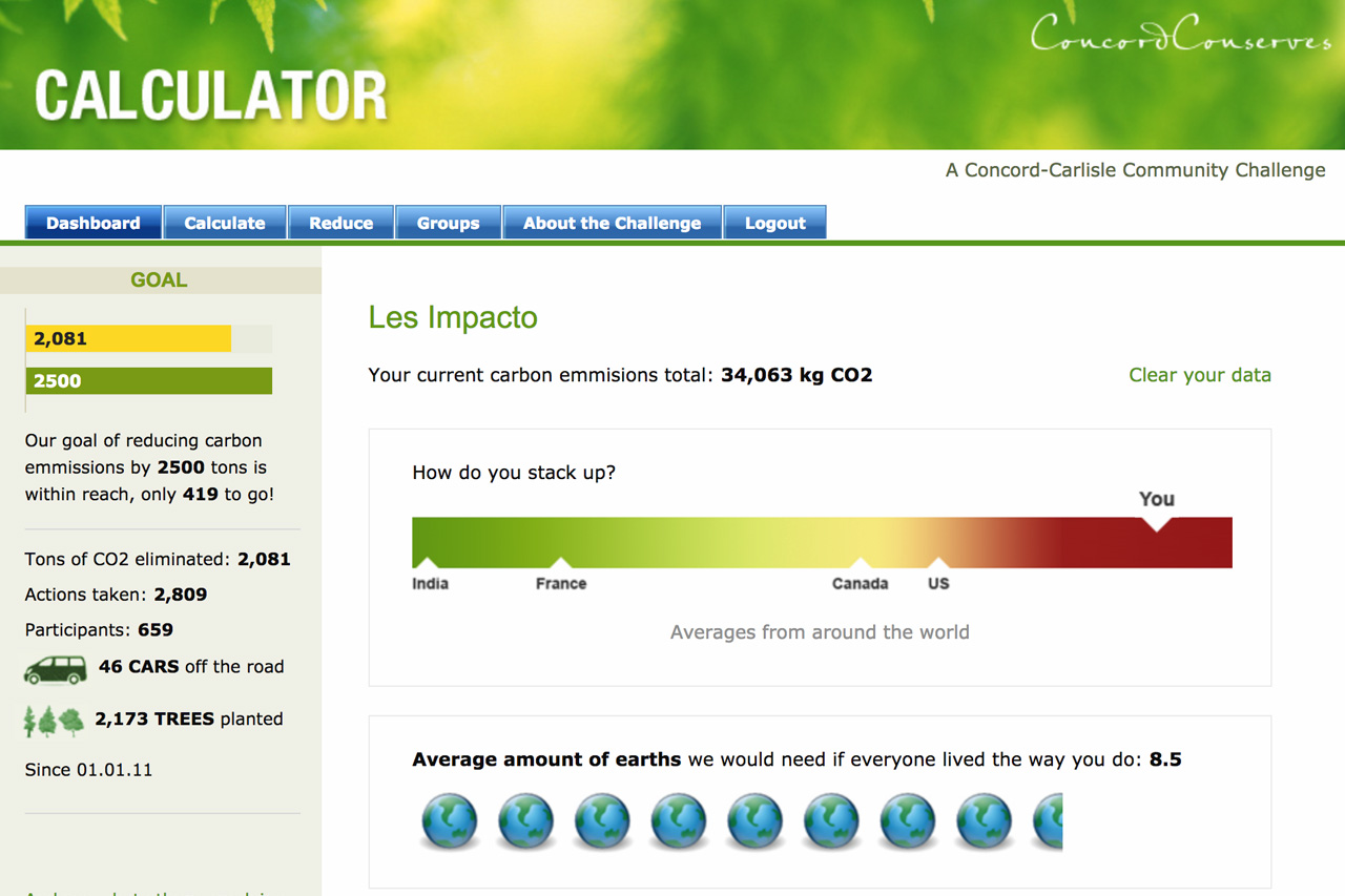
We also inserted a chart on the entry page showing how per capita emissions of Americans stack up to other countries. Don’t be surprised, Americans emit more carbon per person than just about any other country. This type of peer-to-peer comparison chart is a really effective way to get the point across and inspire people to act.
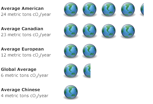
Note the above chart also shows how many planet earths would be needed if everyone on the planet consumed as much as the average in that country.
3. Go local: There are a lot of calculators out there so we decided to make ours as local as possible. Remember ‘act local, think global’? The list of reductions starts with programs offered by the town (e.g. $5 off compact fluorescent bulbs). We also targeted the schools so that the calculator could be used in their curriculum. CCO is all about local too, making it easy to promote it within the community. We also included a master “everyone’s reductions to date” feature showing how much carbon has been reduced by everybody. This feature is an easy way for people to feel a part of a bigger group as well as feel like they are making a more significant contribution.
We learned a lot from this project – about how to build online communities as well as how to engage people to improve the environment. Creating online communities is not easy but understanding what motivates people can make for a far more compelling online experience.
Note, a special thanks to the Concord Carlisle Community Chest for their generous grant, and the support of private donors as well as Fletcher Boland, Jessie Pearl, Christopher Lorch and Kitty Smith who built the calculator. Without their help it would not have happened.


with a Booster program for Healthcare companies.